
What the hell?
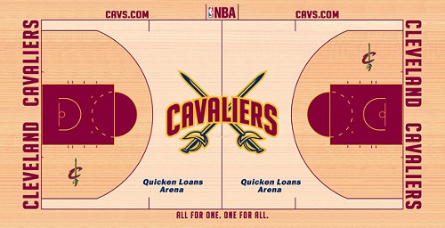
The Cavs officially unveiled the tweaks to their logos awhile back. Now comes the court design update, which is... well, bad.
Why include the swords? Two of them, sans context, as if the freaking sword was the single defining visual landmark of the Cavaliers. And why'd they go with the secondary logo lettering? I like it just fine by itself, but not with the swords. Leave the name across center court with no basketball, no swords, no accoutrements, and you'd have a simple design. More is not better.
Add in the fact that the center court design — especially those freaking swords — is garishly big and you have a giant step backward, the Ramon Sessions of court designs if you will.
Of course, part of the problem is the redesigned logo itself, which now looks like it was outlined in yellow highlighter.
But it's not like screwing up the court design is anything new to the Cavs. Just have a gander through the various betrayals of common sense and aesthetics over on this page and you'll get a good sense of how they've been doing this for years.
This one may not be the worst, but it's still dispiriting to see them pass up an opportunity to make something better.
Follow me on Twitter: @vincethepolack
